turning data into decisions
Automation Dashboard

overview
The legacy reporting tools were disjointed, outdated, and counterintuitive. Marketers couldn’t answer basic questions like: Are my emails driving engagement? Where are leads dropping off? Is this program helping me hit my goals?
I led the redesign of Act-On's Automation Reporting Dashboard to solve this exact problem.
Results
The adoption and engagement rates for the Automation Dashboard have remained consistently high since the product's initial launch. We've witnessed a significant enhancement in customer satisfaction rates. However, there are still a few outstanding customer requests that require attention and resolution.
80%+ of marketers struggle with building and understanding the performance of their programs

“I have all this data, but I don’t know what it means.”
“The numbers are there, but I don’t know what to do next.”
“I don’t know how well my automated program is performing.”

Make complex performance data intuitive, actionable, and aligned with what marketers care about most - RESULTS.
“The Automation dashboard is not super useful for me. If I want to look at the performance of an AP currently, I would go to the campaigns actually. I usually pull up the individual stats and review them. And then I kind of compare the performance week over week... So a lot of my reporting is actually outside of Automation.”
-Emily, marketer at Phionline
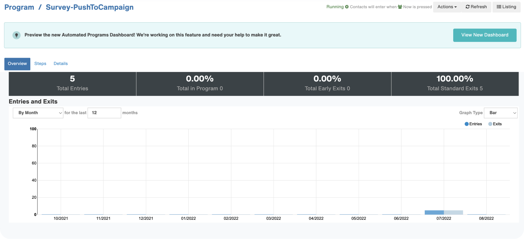
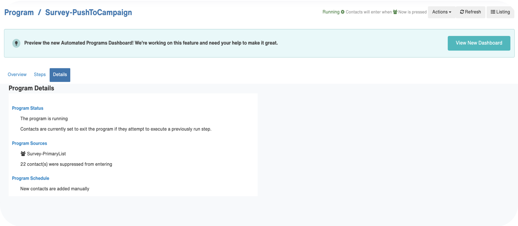
Almost every user faces challenges when using the legacy dashboard

200+
User complaints & escalations about the struggles of using Automated Programs
38+
Hours spent on explaining and trouble-shooting for customers weekly when using Automated Programs
My Role
- Defined product goals in collaboration with PMs and engineers
- Conducted user interviews and internal design workshop
- Audited legacy UX and mapped current workflows
- Delivered interaction models, wireframes, high-fidelity UI, and dev specs
- Conducted usability testing and refined designs
- Partnered with engineering and QA for launch

Pain point #1
Users struggle with getting started with Automation
The majority of our customers continue to use the Classic Editor instead of adopting the new Automatic Journey Builder (AJB). The primary reasons for their reluctance to switch to the new UI (AJB) include the need for extensive planning, and concerns about potential errors or interruptions.
Pain point #2
Users have a hard time understanding how their programs are performing
The current interface is counter-intuitive for navigating program steps and accessing specific statistics. Many users have expressed distrust in the accuracy of the dashboard data and have suggested that comparing the effectiveness of emails would be more helpful.
Pain point #3
Automation is a misnomer
Theoretically, Automation should operate seamlessly on its own. However, in reality, customers still heavily rely on our Customer Success and Tech Support teams for guidance in building and comprehending automated programs. The process involves numerous steps to access desired information, leaving users feeling mentally fatigued after each setup.
The discovery - insights buried in chaos
Lack of context and outdated UI undermined trust in data

No sense of outcomes
Hard to troubleshoot
Defining the vision

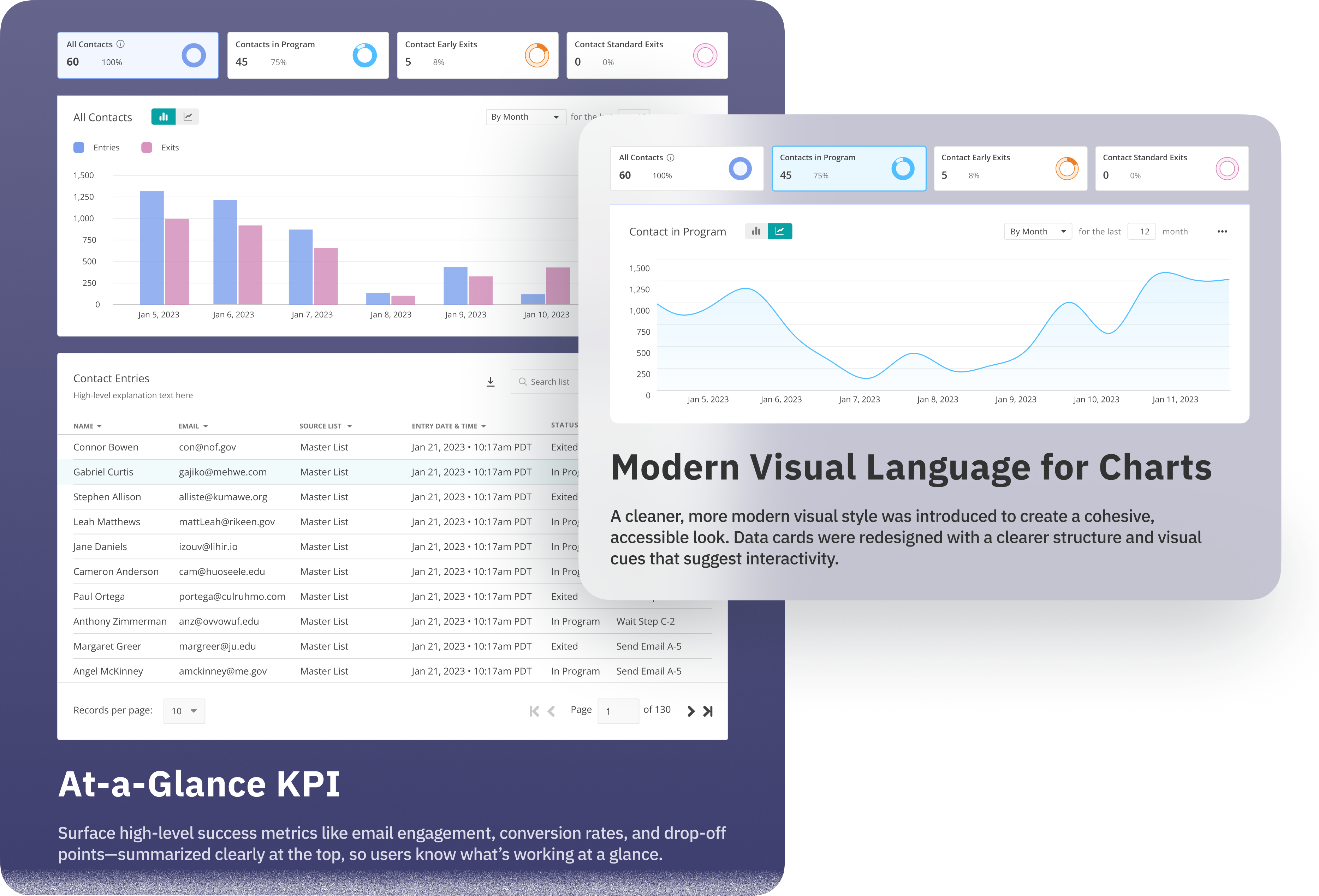
The Solution: Turning complex data into confident decisions


Data
Contact Lists

Performance

Steps

Micro-interactions

Prototype
Data
Contact Lists
Performance
Steps
Micro-interactions
Test
In addition, we sought to understand user preferences regarding searching email message reports within the program dashboard, and how easy it is to understand new design patterns introduced in the dashboard.
Discoverability of the Edit Program


Add New Contacts Actions


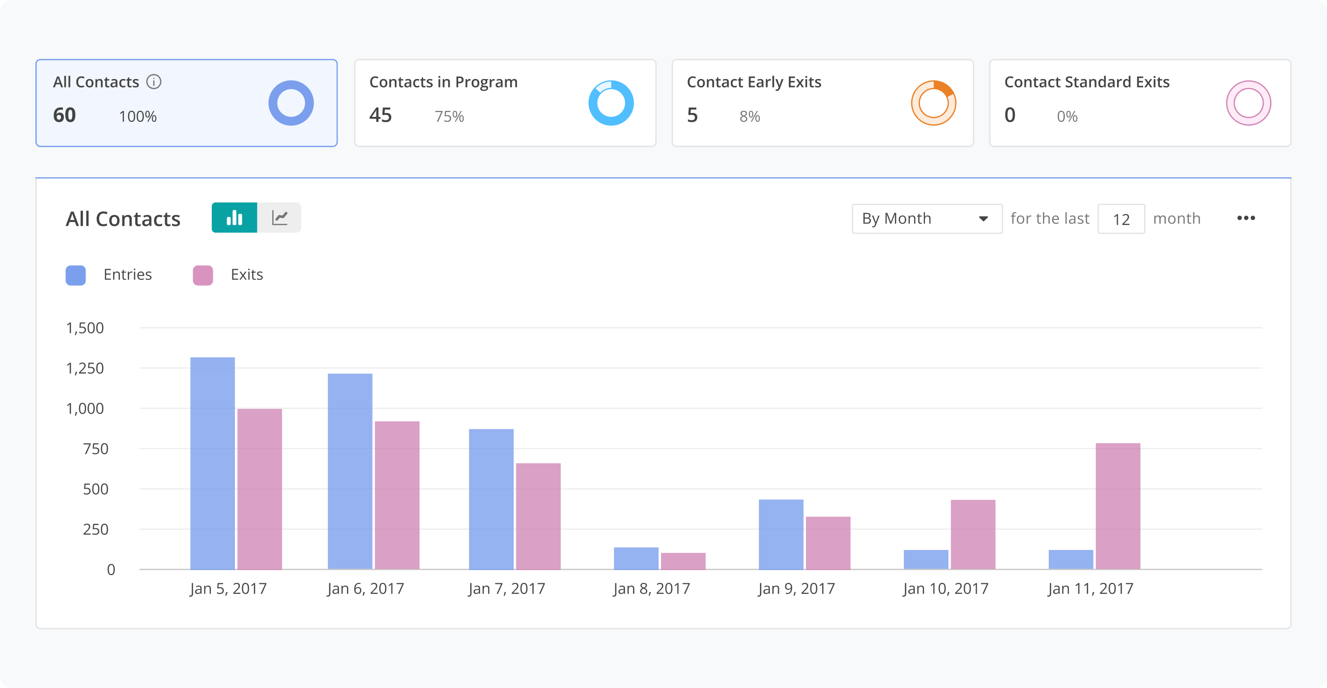
Data Cards


Email Performance


The outcome: Data that drives action
- Reduced support tickets from confused marketers
- Improved program optimization rates, as users could finally pinpoint friction

